
A self-contained UI component is a reusable interface unit that encapsulates its own structure, styling, interaction logic, and internal state so it can function independently in any application context. The term maps closely to what the industry calls an encapsulated component, a concept formalized across Web Components standards, React, and Vue. UXPin describes these units as portable elements with defined properties, behaviors, states, and accessibility requirements bundled into a single deployable piece. Understanding what is a self-contained UI component matters because it directly determines how reusable, testable, and maintainable your frontend codebase becomes. When a component owns everything it needs to render correctly, you can drop it into any project without debugging style collisions or missing dependencies.
What is a self-contained UI component, technically speaking?
A self-contained UI component is defined by one core property: it does not rely on external context to look or behave correctly. Drop it into a new page, a different app, or a hostile CSS environment, and it renders as intended. This independence comes from deliberate encapsulation of three layers: the DOM structure, the visual styling, and the behavioral logic.
The most explicit technical mechanism for achieving this is the Shadow DOM. Shadow DOM scopes both DOM and CSS so that internal styles do not leak outward and global styles from the host page cannot accidentally override the component's internals. This makes styling a deliberate act rather than an inherited accident. A button inside a Shadow DOM tree ignores the host page's "button { color: red }` rule entirely unless the component explicitly allows it.

React and Vue components achieve a similar result without native Shadow DOM. Self-containment in these frameworks comes from restricting all styling and behavior to explicit inputs such as props and slots, and from documenting stable interface contracts. A React component that reads only from its own props and local state, never from a global CSS class or a window-level variable, is functionally self-contained even without browser-level encapsulation.
The arc42 quality model defines autonomy as the condition where a component fulfills its primary use cases without requiring synchronous availability of other components and without sharing UI surfaces. That definition is the architectural gold standard for what self-containedness actually means in practice.
How to verify a component is truly self-contained
Testing is the most honest way to confirm containment. Place the component inside a page loaded with conflicting global CSS rules, switch the active theme, and render it in complete isolation. OpenReplay recommends this hostile-environment testing as the practical litmus test for encapsulation. If the component breaks, you have found an implicit dependency you did not know existed.
Pro Tip: Write a dedicated test harness that injects your component into a page with aggressive CSS resets and a completely different color scheme. Any visual regression you see there is a containment failure, not a design bug.
What architectural principles define self-contained UI components?
Component-based architecture organizes software into independent units with clear responsibilities, each exposed through well-defined interfaces. A component exposes a public API while hiding its internal implementation, which means the consumer of the component never needs to know how it works internally, only what inputs it accepts and what events it emits.
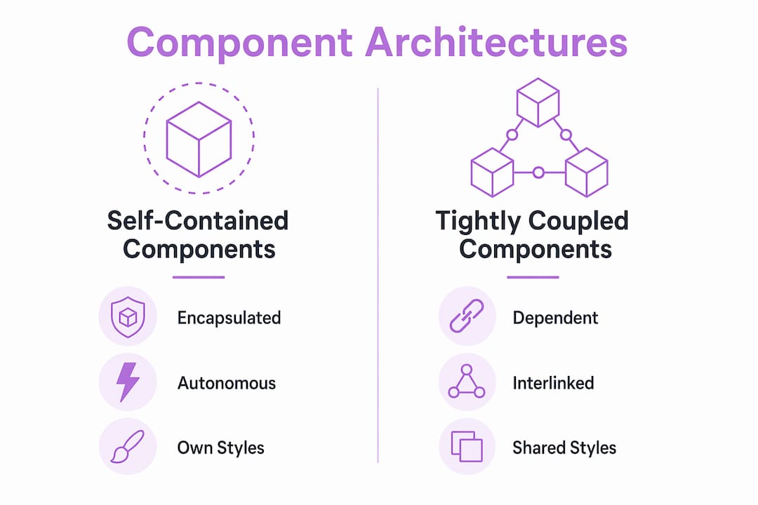
Self-contained UI elements sit at the intersection of two architectural values: low coupling and high cohesion. Low coupling means the component does not depend on its neighbors' state or styling. High cohesion means everything the component needs to do its job lives inside it. These two properties together are what allow teams to develop, test, and deploy components independently.
The comparison below shows how self-contained components differ from tightly coupled ones across the dimensions that matter most to development teams.
| Dimension | Self-contained component | Tightly coupled component |
|---|---|---|
| Styling dependency | Owns all styles internally | Relies on global CSS classes |
| State management | Manages its own local state | Reads from shared global store |
| Testability | Testable in complete isolation | Requires full app context to render |
| Portability | Drops into any project unchanged | Breaks without specific environment |
| Team autonomy | Any team can consume it safely | Requires coordination with owners |
Self-contained systems (SCS) architecture at the backend level follows the same logic: each system owns its UI, logic, and data without sharing surfaces with others. The UI component model mirrors this pattern at the frontend layer. When you build a card component that owns its own image loading, text truncation, and hover state, you have applied SCS thinking to the component level. The payoff is that any team can consume that card without reading your source code.
How do design systems implement and manage self-contained UI components?
Design systems treat self-contained components as atomic, indivisible building blocks. UXPin defines these atomic elements as the smallest units that include states, variants, behaviors, and accessibility requirements as part of their identity. A button is not just a rectangle with text. It is a unit that knows about its hover state, its disabled state, its loading state, its focus ring, and its ARIA label.
Implementing self-contained UI elements inside a design system follows a consistent process:
- Define the component's public API. List every prop, slot, attribute, and emitted event. Anything not on this list is a private implementation detail. Document this API before writing a single line of code.
- Encode all visual states inside the component. Hover, focus, active, disabled, loading, and error states belong inside the component, not in the consuming page's stylesheet.
- Embed accessibility requirements. ARIA roles, keyboard navigation, and focus management are part of the component's contract, not optional additions.
- Write usage guidelines alongside the code. UXPin links governance and documentation directly to component libraries as the mechanism that keeps self-contained components consistent at scale.
- Version the component explicitly. A self-contained component with a stable public API can be versioned independently. Consumers pin to a version and upgrade on their own schedule.
Practical examples of self-contained UI components in design systems include buttons, text inputs, modal dialogs, dropdown menus, notification banners, avatar images, and data table rows. Each of these encapsulates its own visual logic completely. A modal dialog, for instance, owns its own overlay, its own focus trap, its own close behavior, and its own animation. The consuming page provides only the content and a trigger.
What are practical examples and best practices for building isolated UI components?
The most concrete example of isolated UI functionality is a native Web Component built with Shadow DOM. A custom <user-avatar> element that renders a profile image with a fallback initial, a status badge, and a tooltip owns all of that internally. The consumer writes one HTML tag and passes two attributes. Nothing else leaks in or out.
React and Vue components achieve the same result through disciplined prop design. A <PriceTag> component that accepts amount, currency, and locale as props and renders a formatted price string is self-contained because it reads from nothing else. It does not touch window, does not import a global formatter, and does not assume a parent container's width.
Best practices for building truly self-contained components:
- Expose only what consumers need. Every prop you add is a surface area you must maintain. Start with the minimum API and expand deliberately.
- Use CSS custom properties for theming. CSS Shadow Parts and custom properties form a deliberate public styling API that lets consumers customize appearance without breaking encapsulation.
- Avoid global selectors inside components. A component that applies styles to
bodyorhtmlis not self-contained. It is a liability. - Never assume layout context. A self-contained component does not know if it lives in a flex container, a grid, or a fixed-width sidebar. It should render correctly in all of them.
- Test with Storybook or a comparable isolated renderer. Rendering components outside the full application context catches implicit dependencies before they reach production.
Web Components standards enforce the boundary between public interface (attributes and events) and private implementation (Shadow DOM internals), which is the clearest model for what self-containedness requires structurally.
Pro Tip: When building a component for a third-party embed scenario, expose a small set of CSS custom properties like --primary-color and --border-radius as your theming API. This gives consumers meaningful control without letting them reach inside your Shadow DOM.
Key takeaways
A self-contained UI component encapsulates its own structure, styling, behavior, and state so it can be reused across any context without breaking or leaking.
| Point | Details |
|---|---|
| Core definition | A self-contained component owns its structure, styles, logic, and state in one portable unit. |
| Encapsulation mechanism | Shadow DOM enforces style scoping natively; React and Vue achieve it through explicit props and stable contracts. |
| Architectural value | Low coupling and high cohesion allow independent development, testing, and deployment across teams. |
| Design system role | Atomic components encode states, variants, and accessibility requirements as part of their identity, not as afterthoughts. |
| Testing standard | Hostile-environment testing in conflicting CSS and theme conditions is the most reliable proof of true self-containment. |
Why the interface contract matters more than the encapsulation method
I have worked with teams that spent weeks debating Shadow DOM versus CSS Modules versus CSS-in-JS, and almost every time, the wrong question was at the center of the debate. The encapsulation method is a technical detail. The interface contract is the architectural decision that actually determines whether a component is genuinely self-contained.
A component built with Shadow DOM but designed with 12 required props that depend on a global auth context is not self-contained. A React component with zero external dependencies and a two-prop API is. The method matters less than the discipline behind the design.
The trend toward declarative Shadow DOM and platform-native Web Components is real and worth tracking. Browser support has matured significantly, and the case for framework-agnostic components is stronger than it was three years ago. But I would not recommend teams adopt Shadow DOM purely for encapsulation if their existing React or Vue discipline already produces stable, portable components. The overhead is not worth it unless you are building for cross-framework distribution or third-party embedding.
The most underrated advantage of self-contained components is what they do for cross-team collaboration. When a component has a documented public API and no hidden dependencies, a team consuming it does not need to schedule a meeting with the team that built it. That reduction in coordination cost compounds over time in ways that are hard to measure but impossible to ignore once you have experienced the alternative.
My practical advice: pick your encapsulation strategy based on distribution scope. Internal design system components for a single React app need disciplined props and CSS Modules. Components distributed across multiple frameworks or embedded in third-party contexts need Shadow DOM and a formal CSS custom property API. Matching the strategy to the context is the decision that actually matters.
— Lucas
Turn any UI screenshot into a self-contained React component
If you are building self-contained components from scratch for every design you encounter, you are spending time on translation work that a tool can handle.
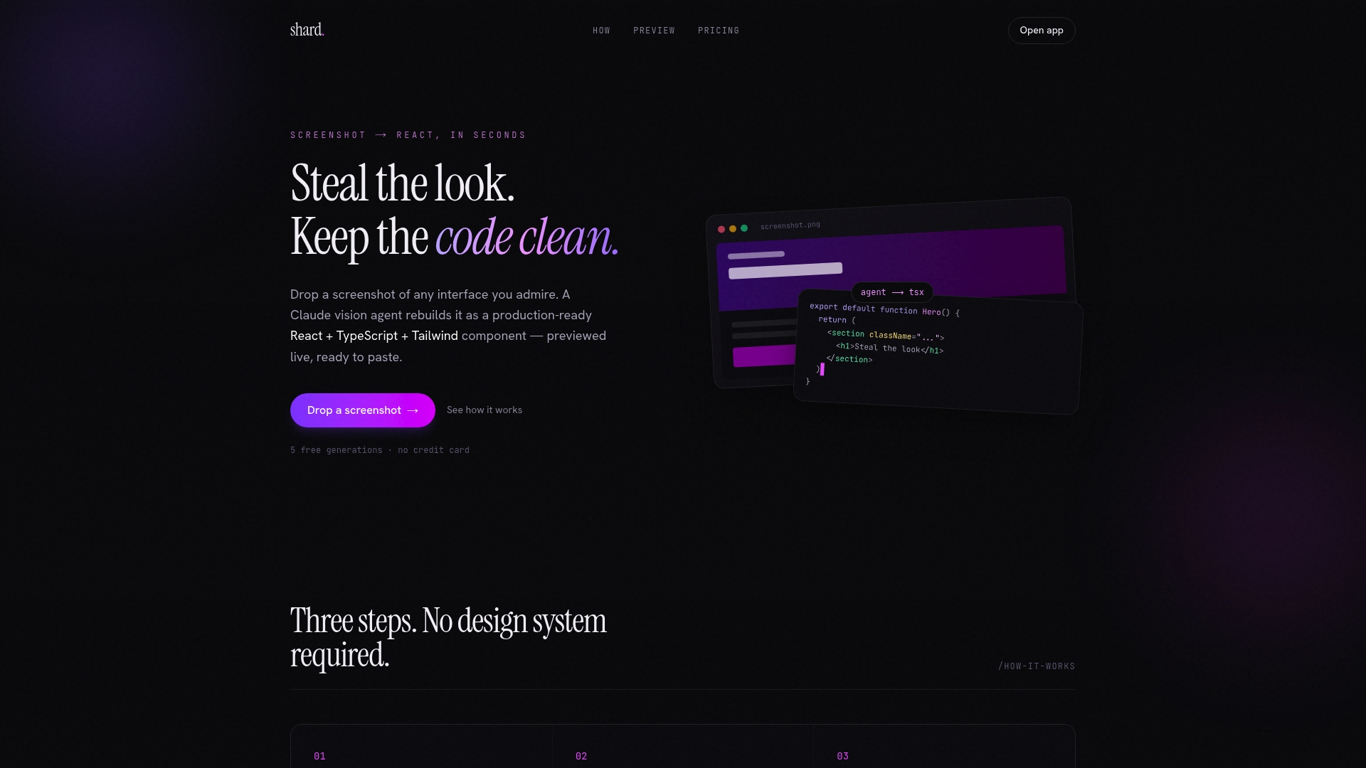
Tryshard takes a screenshot of any UI you want to replicate and generates a clean, ready-to-use React + TypeScript + Tailwind component. The output is self-contained by design: no external style dependencies, no global selectors, just a portable component you can copy directly into your project. You preview adjustments live before copying the code, which means the component you get is already tested against your visual intent. For developers who need to move from design to working code without the overhead of a full design system, Tryshard removes the manual step entirely.
FAQ
What is a self-contained UI component?
A self-contained UI component is a reusable interface unit that encapsulates its own structure, styling, interaction logic, and state so it can function independently in any application context without relying on external styles or shared global state.
How does Shadow DOM make a component self-contained?
Shadow DOM scopes both the DOM tree and CSS styles to the component, preventing internal styles from leaking out and blocking external global styles from affecting the component's internals.
Can React components be self-contained without Shadow DOM?
Yes. React components achieve self-containment by accepting all inputs through explicit props, avoiding global CSS selectors, and managing state locally. The result is functionally equivalent to Shadow DOM encapsulation for most single-framework applications.
What are examples of self-contained UI components?
Buttons, text inputs, modal dialogs, dropdown menus, avatar images, and notification banners are all standard examples. Each encapsulates its own states, variants, accessibility behavior, and styling without depending on the surrounding page.
How do you test whether a UI component is truly self-contained?
Render the component inside a page with conflicting global CSS rules and a different active theme. If the component's appearance or behavior changes unexpectedly, it has an implicit external dependency that breaks its self-containment.