
React UI component libraries are pre-built, reusable interface elements that let developers construct production-grade applications without writing every button, modal, or data table from scratch. In 2026, the ecosystem has matured into two distinct camps: source-code-owned libraries like shadcn/ui and headless primitives like Radix UI on one side, and full-featured enterprise toolkits like MUI and Ant Design on the other. Choosing the wrong one costs weeks of refactoring. This guide breaks down the top ui component libraries react 2026 has to offer, with clear criteria for when each one earns its place in your stack.
1. shadcn/ui: the copy-paste standard for modern React apps
shadcn/ui is the most talked-about library in the React ecosystem right now, and the numbers back that up. With over 109,000 GitHub stars as of March 2026, it has become the default starting point for new projects across startups and agencies alike. That popularity reflects a genuine shift in how developers think about UI ownership.
The core idea is simple but powerful. Instead of installing a black-box package and hoping the maintainers expose the right props, you copy the component source directly into your project. The copy-paste ownership model means the code lives in your repo, you control it completely, and there is no node_modules lock-in. Built on Radix UI primitives and styled with Tailwind CSS, shadcn/ui gives you accessibility for free while keeping full visual control.

Pro Tip: When you add a shadcn/ui component, treat it like your own code from day one. Rename it, restructure it, and extend it without hesitation. That is the entire point.
2. MUI: the enterprise workhorse with 95,000+ stars
MUI (formerly Material UI) remains the most widely deployed React UI toolkit in enterprise environments. MUI and Ant Design together account for the lion's share of large-scale React deployments, with MUI sitting at 95,000+ GitHub stars and Ant Design at 97,000+. Both offer 60+ production-ready components covering every pattern a complex application needs.
MUI's strength is its maturity. The theming system, the MUI X data grid, and the integration with design tokens make it a natural fit for teams that need consistency across dozens of screens. The tradeoff is bundle size and opinionated styling. If your design departs significantly from Material Design, you will spend real time overriding defaults.
3. Ant Design: enterprise-grade depth for data-heavy apps
Ant Design edges MUI in GitHub stars and matches it in component depth. Advanced data tables, forms, and production workflows are where Ant Design genuinely shines, making it the preferred react ui design framework for internal tools, admin dashboards, and B2B SaaS products. The component API is thorough, sometimes to a fault, but that thoroughness pays off when you need a date range picker with timezone support or a transfer list with drag-and-drop.
Ant Design's ecosystem also includes Pro Components, a layer of higher-order components built specifically for CRUD-heavy enterprise apps. Teams that commit to Ant Design rarely need to reach outside it.
4. Chakra UI: the balance point between speed and flexibility
Chakra UI occupies a specific and valuable niche. It is not as minimal as shadcn/ui and not as heavy as MUI, which makes it the right call for product teams that need to move fast without sacrificing design quality. The component API is clean, the default theme is tasteful, and the accessibility story is solid out of the box.
Chakra UI's style props system lets you apply responsive styles inline without writing separate CSS files. For teams without a dedicated designer, this approach produces consistent results faster than most alternatives. The library works especially well for consumer-facing products where the design needs to feel polished but not corporate.
5. Mantine: 120+ components and 100+ hooks in one package
Mantine is the most feature-complete library on this list relative to its bundle size. Mantine ships 120+ components and over 100 built-in hooks, covering everything from rich text editors to spotlight search. That breadth means you can build a full product without reaching for a second library.
The hooks are genuinely useful in daily development. useForm, useDisclosure, useLocalStorage, and useMediaQuery handle patterns that every React app needs, and they are designed to work naturally with Mantine's component layer. For solo developers and small teams, Mantine reduces the number of decisions you need to make.
6. Radix UI and React Aria: the headless foundation
Headless UI libraries separate logic and accessibility from styling entirely. Radix UI and React Aria are the two most recommended headless foundations in 2026, and for good reason. They handle keyboard navigation, ARIA attributes, focus management, and screen reader compatibility so you never have to write that code yourself.
The tradeoff is that headless libraries require you to bring your own styles. That is a feature for teams with strong design systems and a burden for teams that need to ship quickly. Radix UI is the foundation that shadcn/ui builds on, which is why shadcn/ui inherits strong accessibility without any extra configuration.
7. Headless vs. pre-styled: which approach fits your project?
The choice between headless and pre-styled libraries comes down to one question: does your project prioritize speed of deployment or depth of customization? Monolithic libraries suit heavy enterprise CRUD apps that need stability and a complete component set. Headless-first libraries suit teams building custom design systems where visual control is non-negotiable.
| Approach | Best for | Examples | Tradeoff |
|---|---|---|---|
| Pre-styled | Fast shipping, consistent defaults | MUI, Ant Design, Chakra UI | Harder to override visual defaults |
| Headless | Custom design systems, full control | Radix UI, React Aria | Requires styling from scratch |
| Hybrid | Balance of ownership and speed | shadcn/ui | Requires Tailwind familiarity |
Pro Tip: If you are building an internal tool on a deadline, reach for MUI or Ant Design. If you are building a product where the UI is a differentiator, start with shadcn/ui or Radix UI and own every pixel.
8. Key factors for choosing a React UI library in 2026
Picking the right library from this list requires more than counting GitHub stars. Here are the factors that actually matter:
- Bundle size and tree-shakability. Fine-grained imports and tree-shakability are now table-stakes requirements. Libraries that force you to import the entire package will inflate your production bundle. Check whether the library supports modular imports before committing.
- Accessibility compliance. Accessibility is mandatory in 2026. Writing custom accessible components from scratch is a known trap. Choose a library that builds on Radix UI or React Aria primitives, or one that has a documented accessibility audit.
- Customization depth. Consider how far you need to deviate from the library's defaults. If your brand has a strong visual identity, a headless or hybrid library will save you from fighting the framework.
- React Server Component compatibility. Modern React apps increasingly use RSC. Verify that your chosen library does not rely on client-only APIs in ways that break server rendering.
- Community and maintenance. A library with active maintainers, a public roadmap, and a Discord community is a safer long-term bet than one with sporadic commits.
9. nuka-ui and Cladd: the emerging libraries worth watching
Two newer entries are gaining traction among developers who want modern architecture without the legacy decisions baked into older libraries.
nuka-ui is a production-grade library built on Tailwind v4 with a focus on composability, accessibility, and scalability. Its API is designed for complex UI needs, and its build system reflects current best practices rather than decisions made five years ago. For teams already running Tailwind v4, nuka-ui slots in with minimal friction.
Cladd takes a different approach. It provides an opinionated design system with dark-first theming, accent color support, and app-grade controls built specifically for dashboards, editors, and internal tooling. Where most libraries treat dark mode as an afterthought, Cladd treats it as the primary design context. That distinction matters for teams building developer tools or data-heavy interfaces where dark mode is the default user preference.
Pro Tip: Evaluate nuka-ui and Cladd on a non-critical feature first. Their APIs are well-designed, but community resources are thinner than MUI or shadcn/ui, so budget extra time for edge cases.
10. Side-by-side comparison of top React UI libraries
The table below summarizes the most relevant dimensions for choosing among the top react libraries 2026 has to offer.
| Library | Stars | Accessibility | Customization | Best use case |
|---|---|---|---|---|
| shadcn/ui | 109,000+ | High (Radix UI) | Full ownership | Product UIs, design systems |
| MUI | 95,000+ | Good | Theme-based | Enterprise apps, dashboards |
| Ant Design | 97,000+ | Good | Theme-based | B2B SaaS, admin tools |
| Chakra UI | 38,000+ | Good | Style props | Consumer products, MVPs |
| Mantine | 27,000+ | Good | Theme + CSS | Full-featured product apps |
| Radix UI | 16,000+ | Excellent | Full (headless) | Custom design systems |
| nuka-ui | Emerging | High | Composable | Modern Tailwind v4 projects |
| Cladd | Emerging | Good | Opinionated | Dashboards, internal tools |
Key takeaways
The best React UI component library in 2026 is the one that matches your project's customization requirements, accessibility standards, and team velocity, not the one with the most stars.
| Point | Details |
|---|---|
| shadcn/ui leads in ownership | Its copy-paste model gives full code control, making it the top choice for custom product UIs. |
| MUI and Ant Design own enterprise | Both offer 60+ components and mature ecosystems built for large-scale, data-heavy applications. |
| Headless libraries maximize flexibility | Radix UI and React Aria provide accessibility primitives for teams building custom design systems. |
| Bundle size is a real cost | Tree-shakability and modular imports should be verified before adopting any library in production. |
| Emerging libraries fill modern gaps | nuka-ui and Cladd address Tailwind v4 and dark-first design needs that older libraries handle poorly. |
Why the ownership question changes everything
I have watched teams spend three weeks fighting a UI library's theming system to match a brand color palette. That experience is avoidable, but only if you ask the right question before you start: who owns the component code?
The shift toward composability and code ownership is the most significant trend in the React UI space right now, and shadcn/ui crystallized it. Before shadcn/ui, the industry accepted that UI components lived in node_modules and you worked around their constraints. That assumption is now being challenged across the board, and it is changing how newer libraries design their APIs.
My honest advice: if you are starting a new product in 2026, default to shadcn/ui unless you have a specific reason not to. If you are building an internal enterprise tool with a tight deadline, MUI or Ant Design will get you to production faster. If your team has strong design opinions and the time to execute them, Radix UI gives you the cleanest foundation. The worst decision is picking a library because it has the most stars without mapping it to your actual constraints.
— Lucas
Build React components faster with Shard
Choosing the right library is only half the work. Translating a design into actual component code is where most time gets lost.
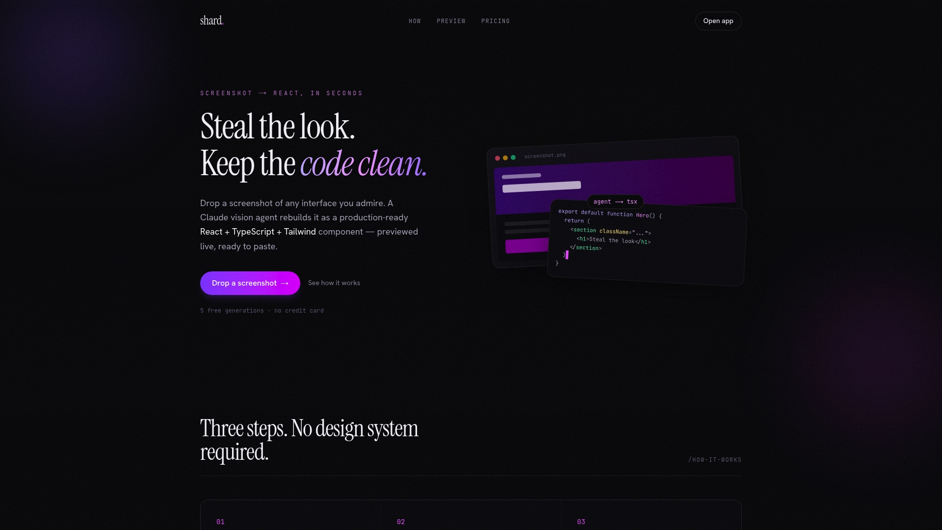
Shard solves that directly. Drop a screenshot of any UI you want to build, and Shard's vision agent generates a ready-to-use React + TypeScript + Tailwind component in seconds. The output is clean, self-contained code you can drop straight into a shadcn/ui or MUI project without modification. You preview adjustments live, copy the code, and move on. For teams prototyping with popular react component libraries, Shard cuts the gap between design inspiration and working code to near zero.
FAQ
What is the most popular React UI library in 2026?
shadcn/ui is the most prominent library in 2026 with 109,000+ GitHub stars, though MUI and Ant Design remain dominant in enterprise deployments with 95,000+ and 97,000+ stars respectively.
What is a headless UI library in React?
A headless UI library provides component logic and accessibility behavior without any built-in styles. Radix UI and React Aria are the leading examples, giving developers full visual control while handling keyboard navigation and ARIA compliance automatically.
How do I choose between shadcn/ui and MUI?
Choose shadcn/ui when you need full code ownership and design flexibility. Choose MUI when you need a complete, stable component set for an enterprise application and want to minimize decisions about component architecture.
Does tree-shakability matter when picking a React UI library?
Yes. Tree-shakability and modular imports directly affect your production bundle size. Libraries that require full-package imports will ship unused code to your users, which slows load times and hurts performance scores.
Are nuka-ui and Cladd production-ready in 2026?
Both are production-grade but have smaller communities than established libraries. nuka-ui targets Tailwind v4 projects with a composable API, while Cladd focuses on dark-first design systems for dashboards and internal tools.